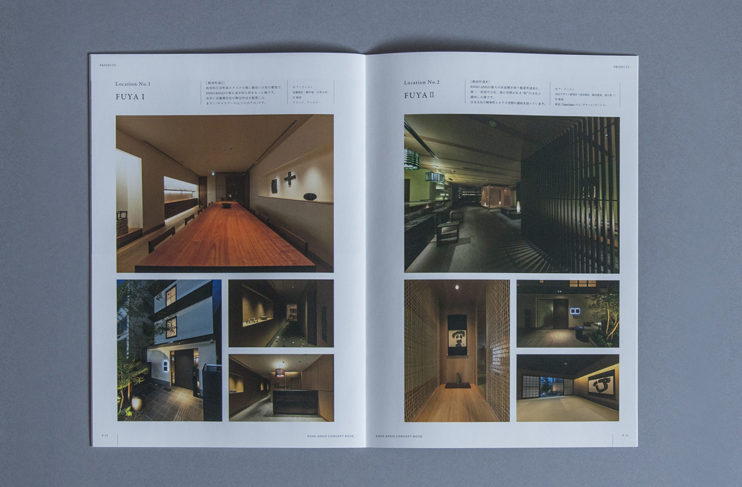
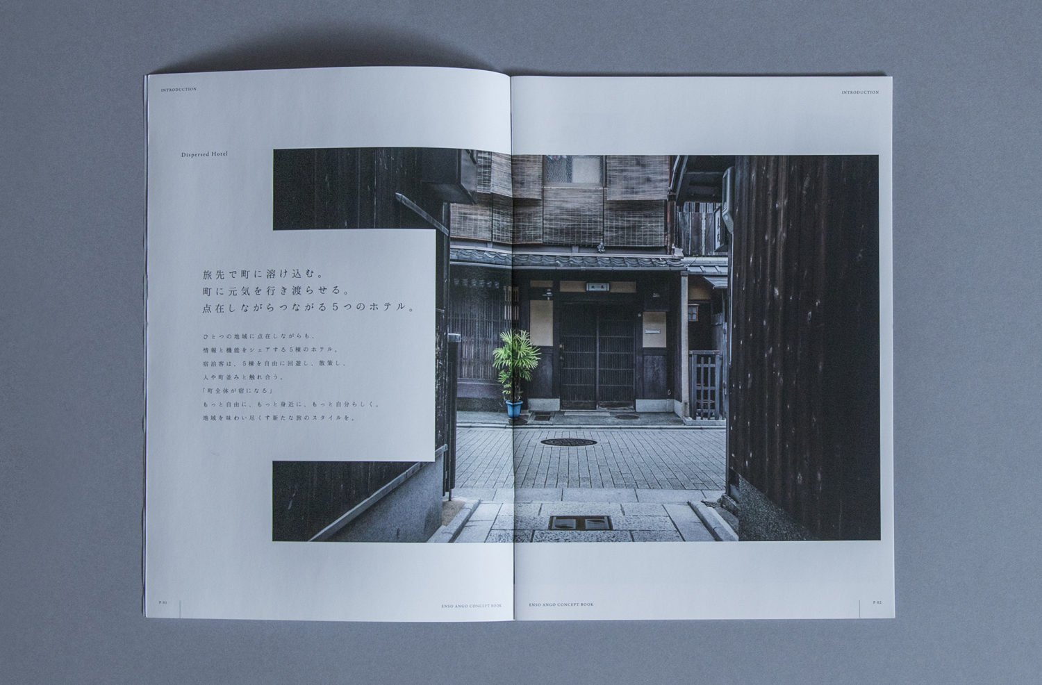
2018年に京都の中心にオープンした、分散型ホテル。
全部で5棟から構成されており、
それぞれのホテルの施設は完成されたものではありませんが、
それぞれのホテルを行き来することで、人々の交流、体験を通して
京都という街への理解を深めることを目的としています。
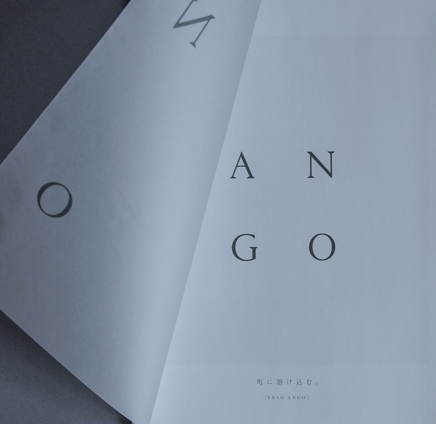
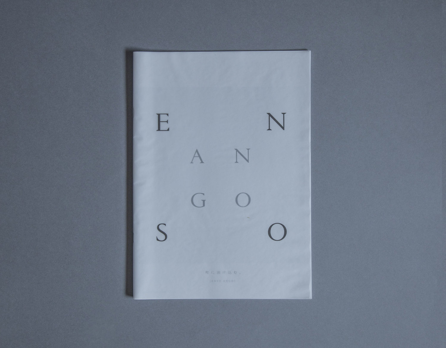
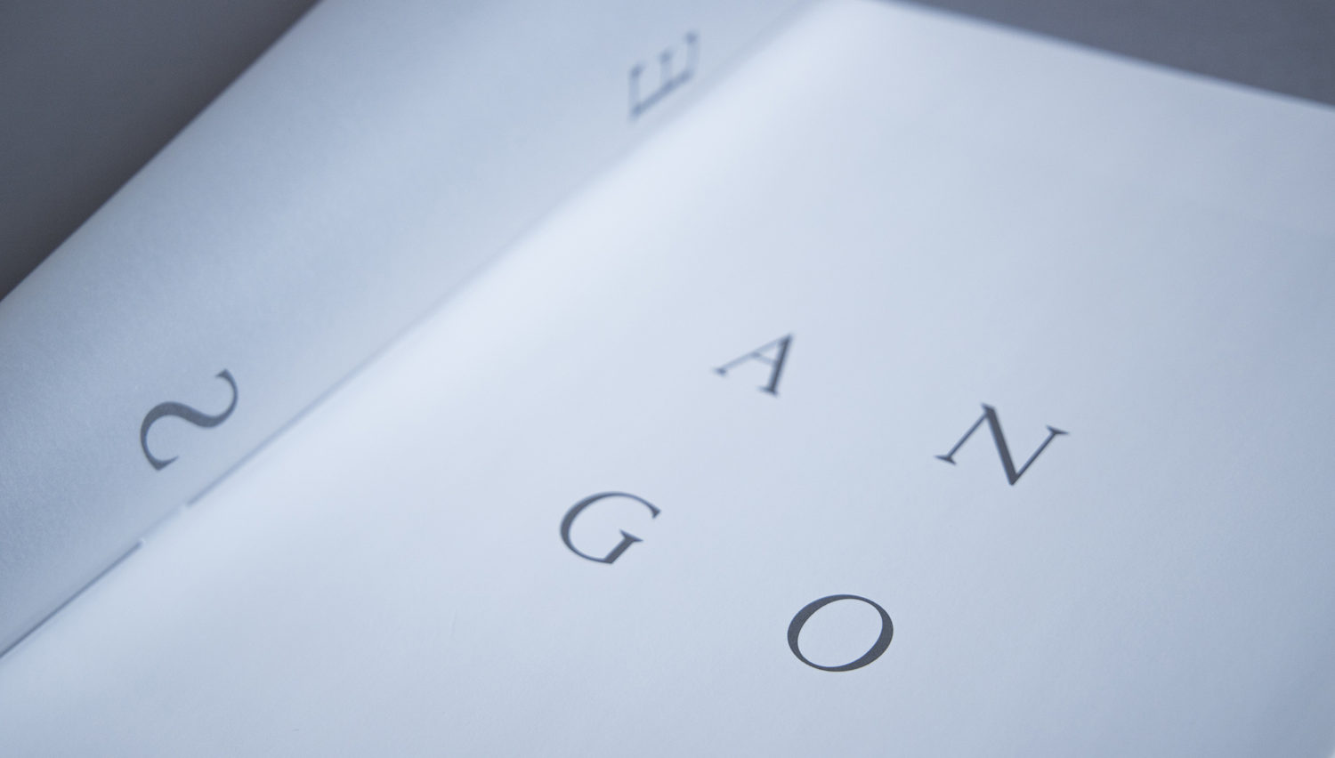
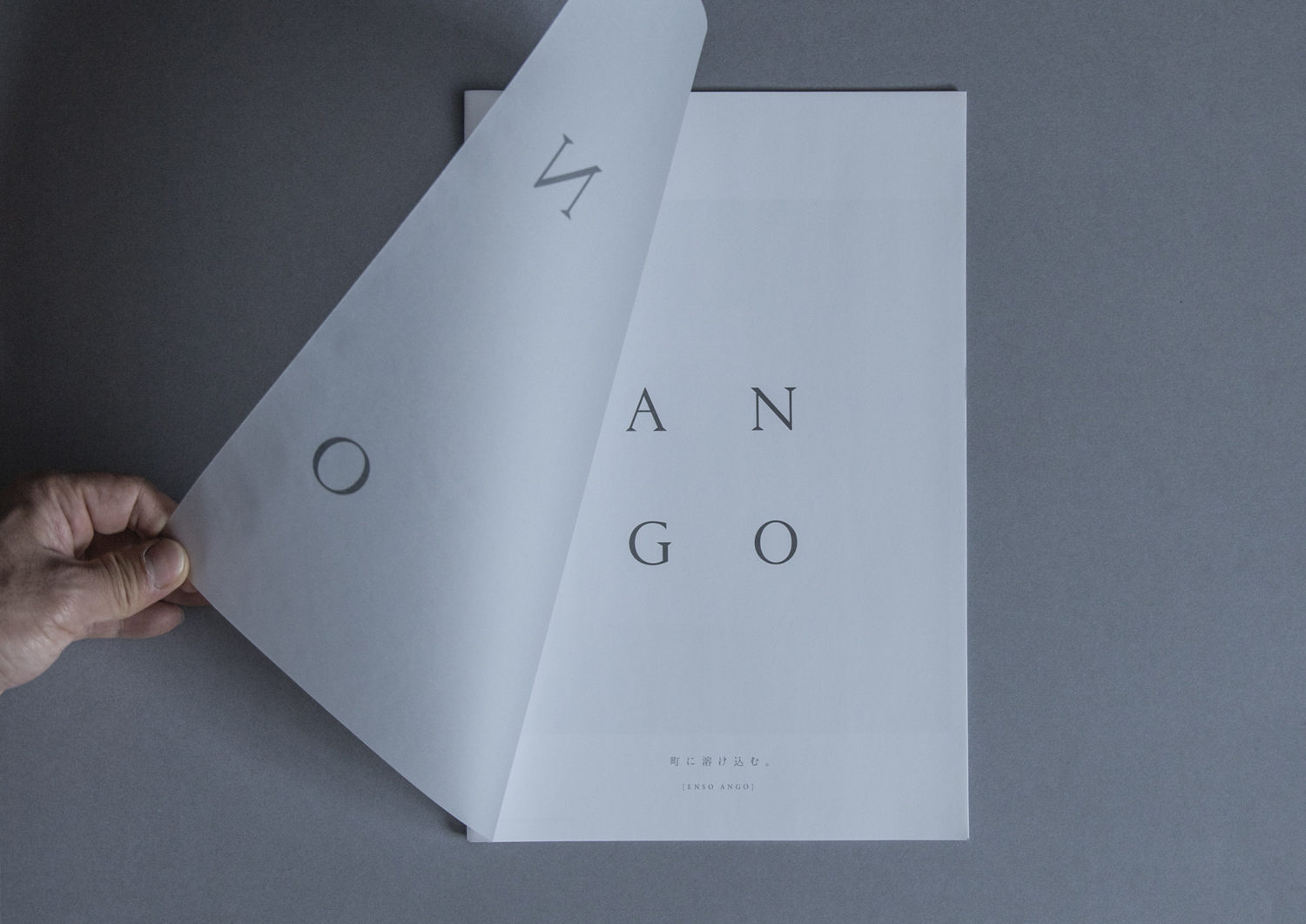
ロゴは、古くから日本の仏教で使われている二つの言葉、
最大であり最小でもある無限の宇宙を示す意味を持つ「円相」、そして
心の発見を意図した言葉「安吾」から構成されています。
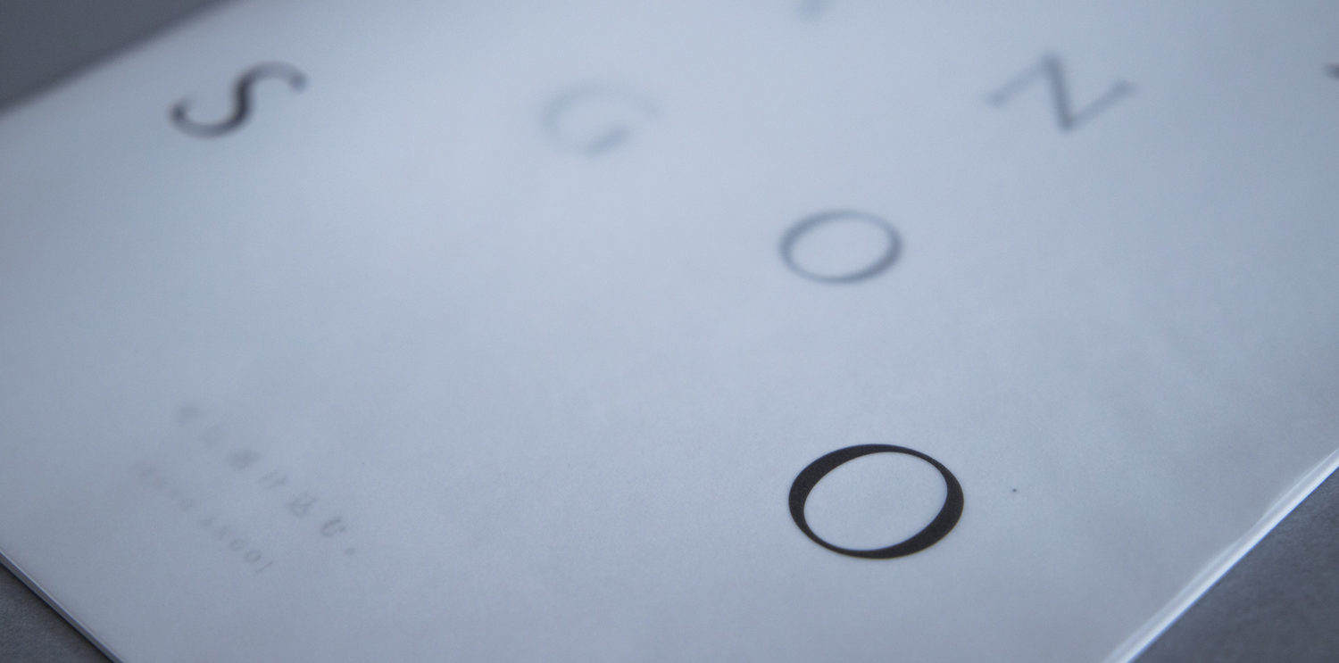
完成することのないホテル。
それを表現するために、2枚の透過する紙を使用し、
それぞれに「円相」と「安吾」を解体して表示させることで、
2枚の髪が重なった時に初めて完成する表紙にしました。
—–
A dispersed hotel that opened in the center of Kyoto in 2018
and considers the city of Kyoto as a communication.
There are 5 buildings in total,
and each building does not have facilities that have been completed as hotels,
but the purpose is to improve understanding of the city
through people’s interaction and experiences by going back
and forth between the hotels.
The logo is an ancient Japanese Buddhism word.
It was thought of as a combination of two words: “en phase”,
which represents the infinite universe,
which is the largest and smallest,
and the word “an relief” intended to discover the heart.
A new hotel with no complete form.
In order to express it,
I used a transparent paper,
and I expressed it on the cover
where the logo was completed only when the two words overlapped.

-
ClientThe global inc.
-
Creative AgencyConcent works
-
ProducerShinzi Suzuki
-
Art directorNori Yokoyama
-
Copy writerAyumu Ishikawa
-
DesignerNori Yokoyama